Why build this instead of using existing trackers?
I built Notebook as a product and engineering experiment around a single pain point: most habit tools interrupt momentum before users can even capture what they want to do. We had to open forms and fill them in before we could capture goals and tasks.
The core product goal was simple:
- open
- type
- structure as you go
- stay in the flow
One continuous surface replaced separate, form-heavy flows.
What interaction model made that possible?
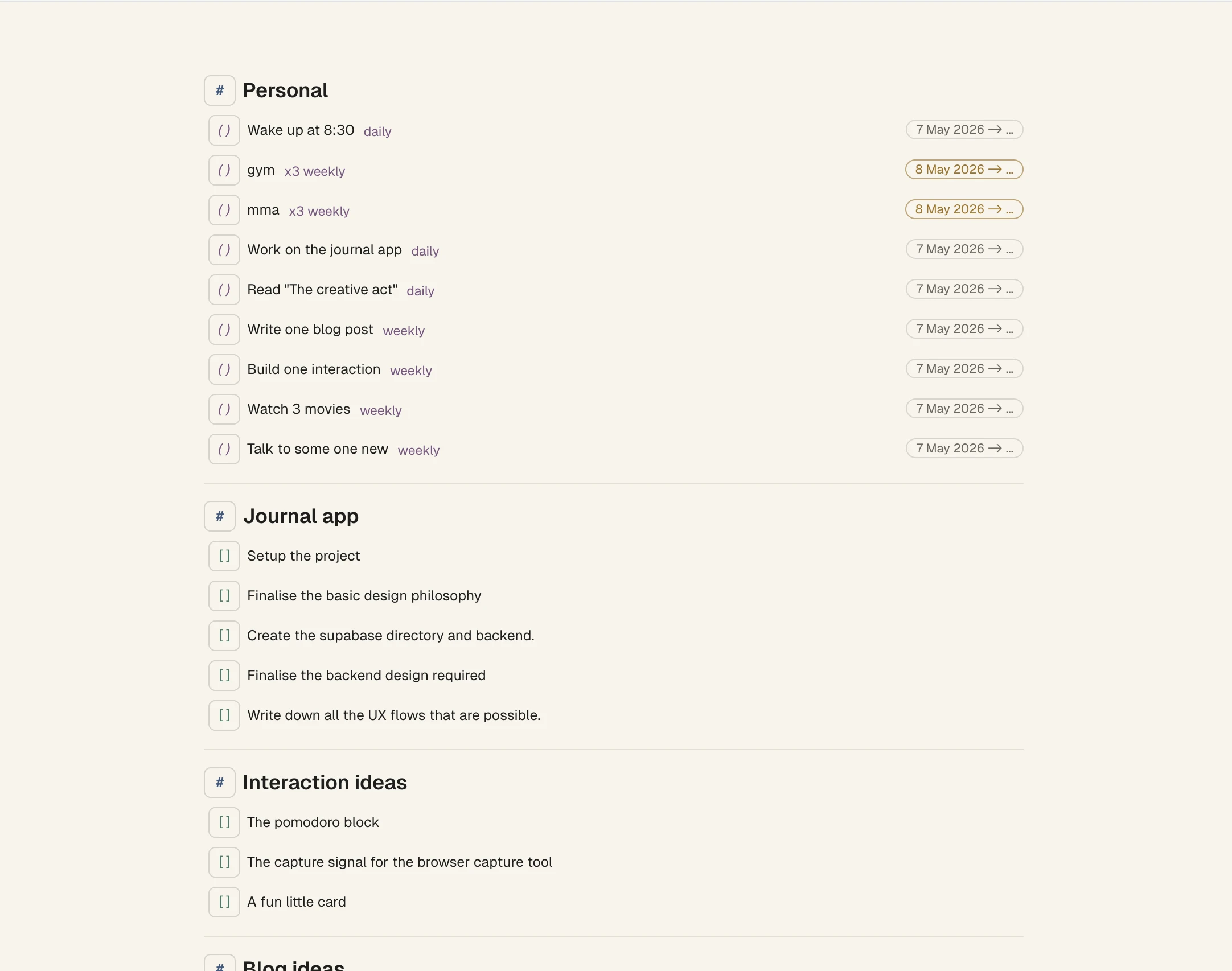
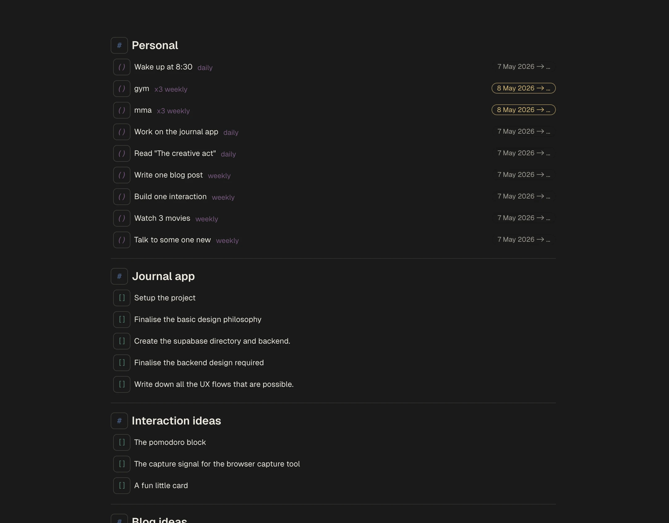
I chose a block model over feature-specific forms. The inspiration came from Notion's block-based model. Each line could become a habit, task, note, timer, or reminder depending on user intent. The capture phase of a task or goal had to be fast. Users came to the page and simply typed.
This decision positioned the product as an editor-like workspace, not a multi-screen planner.
Deleting tasks removed them from the flow but un-archiving deleted tasks brought them back where they were.
How did typed text become structured input?
Users could type patterns like:
Workout every MondayRead at 8pmDeep work for 25m
The system parsed scheduling and recurrence inline. I took inspiration from Apple Reminders and captured frequency and timings directly from sentences users could type.
Easy way to capture deadlines.
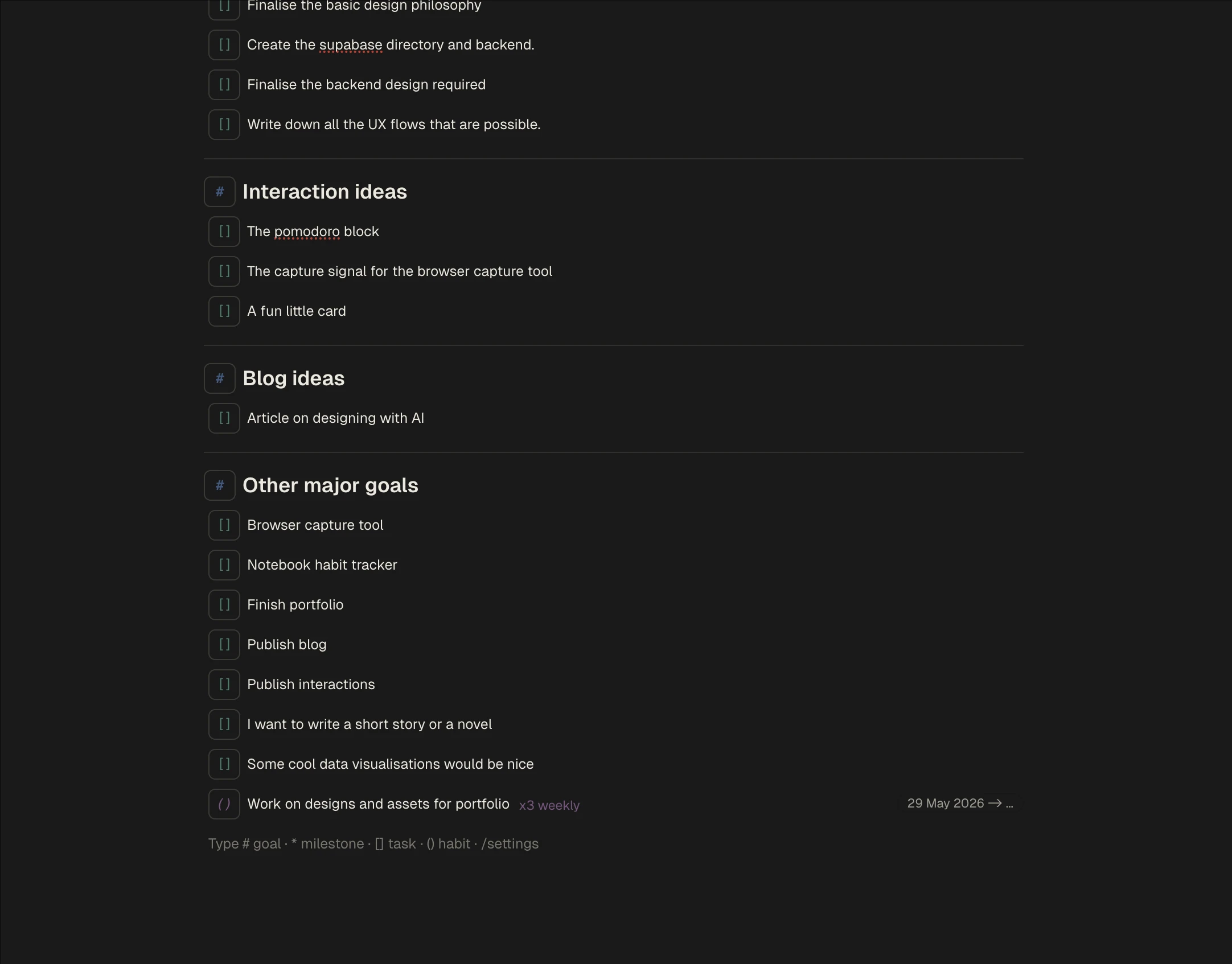
Other interactions
Fast capture alone was not enough; the system needed supporting interactions that preserved momentum under real usage complexity. So I added a way for users to track habits based on what they had already marked done in the past.
Date controls: users could track completeness by following the calendar for that habit.
Capturing habits using the same parsing logic as dates for tasks.
Alternate interactions
Keyboard-first capture did have some issues, however. Sometimes we have to expect users to err, so we had to let users switch between blocks.
Block transforms avoid mode-switching into separate settings flows.
I added search so users could find tasks in a long list as fast as possible. Cmd+K meant users rarely had to touch the mouse.
Cross-notebook search keeps retrieval as fast as capture.
User testing with friends revealed there were some issues with getting started. Understandable, since a blinking cursor alone did not suggest a notebook-style habit tracker.
Hints to ensure users didn't feel lost in a blank workspace.
Just for fun, multiple theming options were also added. The settings page was reachable through a keyboard-typed route as well. Users never had to touch a mouse if they used the design properly.
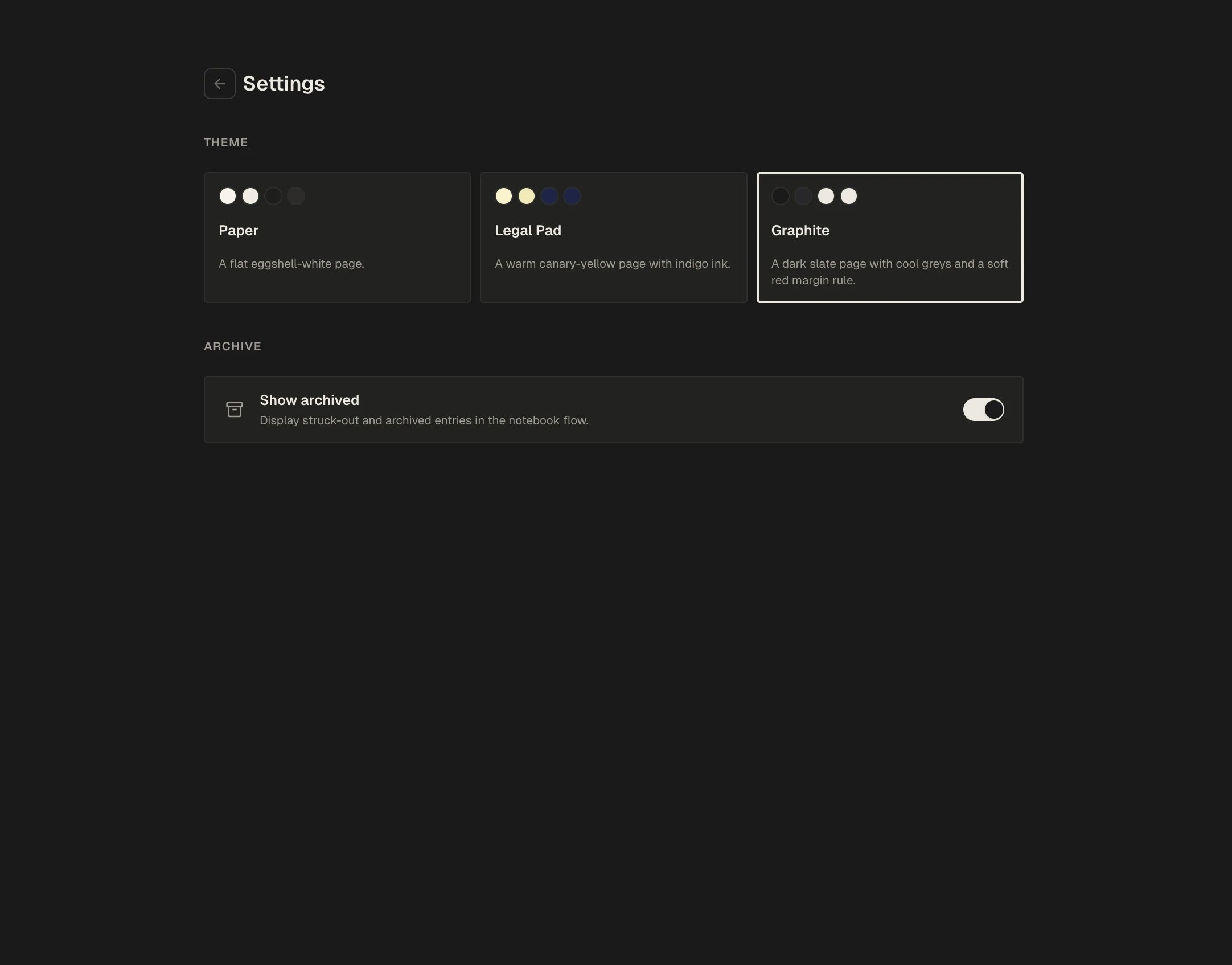
Customization controls exist without changing the core interaction model.
Key decisions and tradeoffs
The entire design was made with a single constraint, users should never use a mouse if they don't have to. There were plenty of challenges to meet this requirement.
- How to manage routes was the major challenge for me. Adding links would push users back to the mouse. I used the
/paradigm established by Notion (at least to my knowledge) to route users to different pages. - Block architecture: initial design iterations focused on a habit tracker that was basically one large markdown file. I kept losing track of ordering as users updated the notebook, so I migrated to an operation-based backend that kept notebook lines persistent in client-side state.
- Optimistic updates: building with Claude or another LLM does not treat optimistic updates as the default. I added them so the client state was never tampered with before updates reached the database. Errors often meant large chunks of input simply vanished—a painful lesson.
Learnings
Building my own relatively high-complexity application provided a lot of learning opportunities, especially around how important engineering is for a good user experience. With the amount of knowledge we have at our hands, designers can improve their craft by understanding a bit more about how the screens they design are actually built. A major example for me is optimistic updates. These are not engineering optimisations—they are design patterns that keep users from losing context while still maintaining data integrity between what they do and the technical realities of a physical network.