Endolibrary
Endolibrary is a desktop web-application that helps doctors create endoscopy reports quicker and with more accuracy. The project was part of my internship at Mimyk, a healthcare start-up at IISc. We aimed to integrate the products bespoke endoscope and ideated how to integrate AI to help doctor’s generate reports that are more accurate.
RESEARCH
Understanding the problem and context
To understand the context of use of the product, we began by travelling to various hospitals in Bangalore. The procedure room was often crowded and the reports had to be generated within 3-5 minutes.
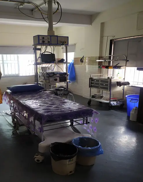
We conducted interviews with the doctors, nurses and operators at the hospital to understand their primary jobs. The doctors often only used the software to create reports, while nurses and operators used the software most often for entering in patient details and connecting scopes.
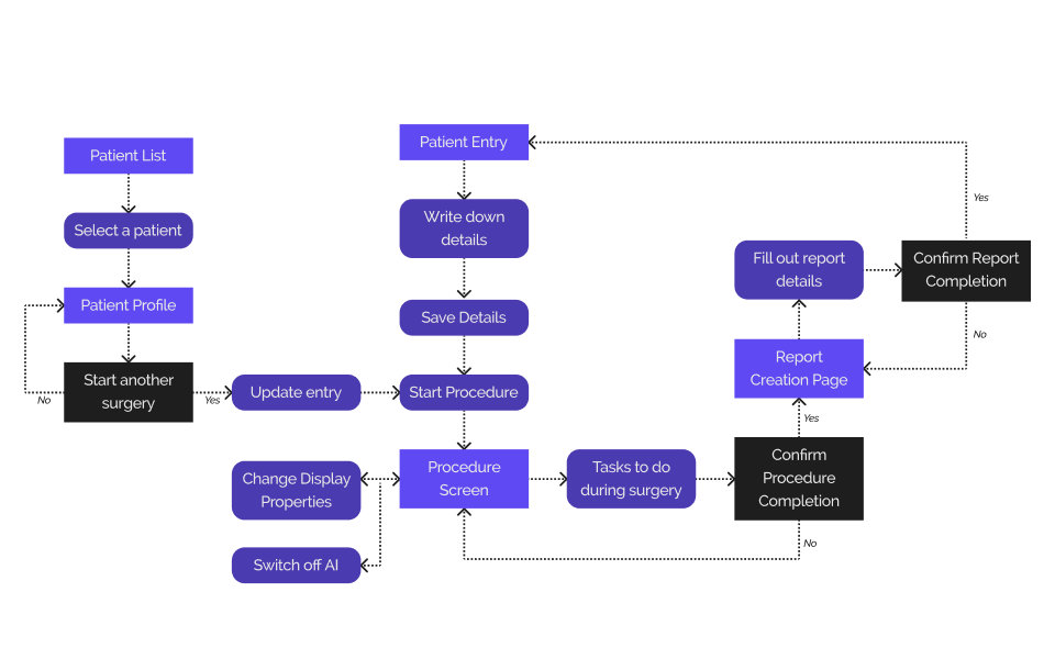
The above procedures helped us create a user flow diagram that we used as the primary driver for our design process. We focused on the user flow of generating reports so that we could focus on the primary use case of the product without worrying in detail about onboarding, connecting to hospital systems or other secondary functions that the product would require.
DESIGN
Solving for complexity and user jobs
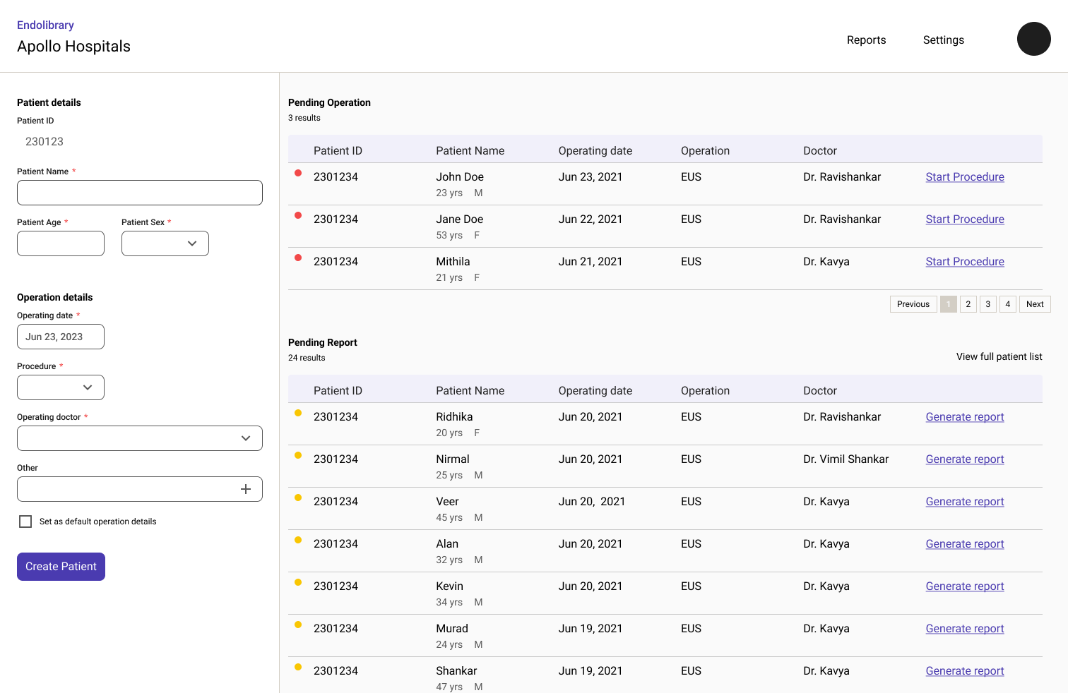
One of the first issues we wanted to fix in existing products was complexity. The current softwares we saw in use were more complex than it required to be, with difficult to use settings and dashboard that were often skipped over due to the users not understanding the reason for it’s inclusion. We created a list of all data and functional elements available in the product and reorganized them based on importance. We decided only the core features that were needed to generate report would be available directly.
We noticed that the new design provided significant improvement in how the users were able to find patients for operations and to do more technical tasks like adjusting image brightness of scope video feed.
DESIGN
Simplifying and modernizing forms
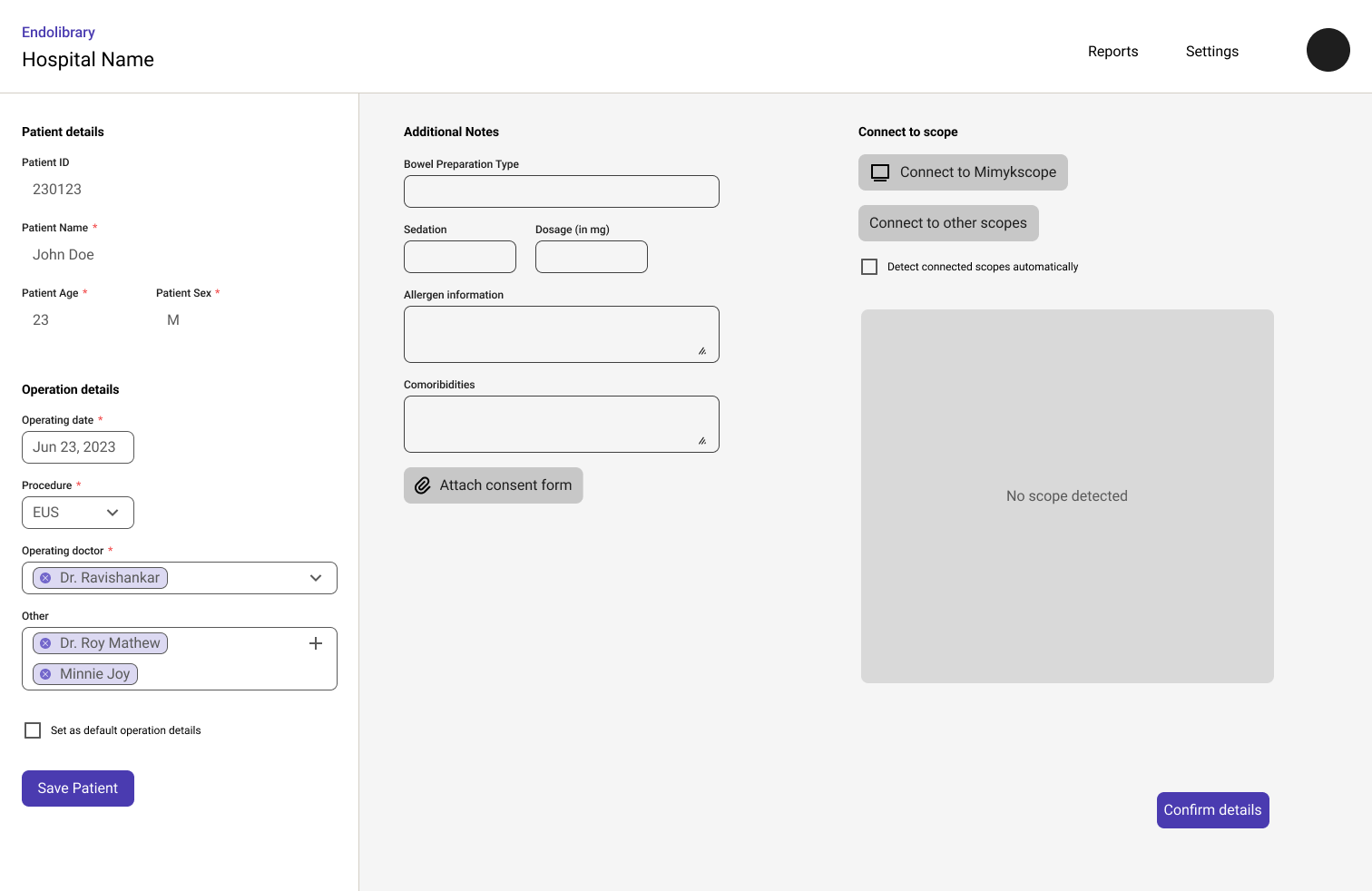
We decided to simplify the forms we found for patient entry. One of the pain points we noticed in the hospitals were that they found patient entry as a bottleneck. Often the nurses were too busy to enter patient details into the monitor, so they batched the entries to be done together before the operation times were scheduled. This made finding the required patient harder than it should have been. We provided a clear interface to allow the nurses to quickly identify the patients that were needed. We also successfully reduced the form size by 30-40% while improving the form’s match with internationally recommended reporting standards as mentioned here. [link to the endoscopy paper]
DESIGN
Designing for AI
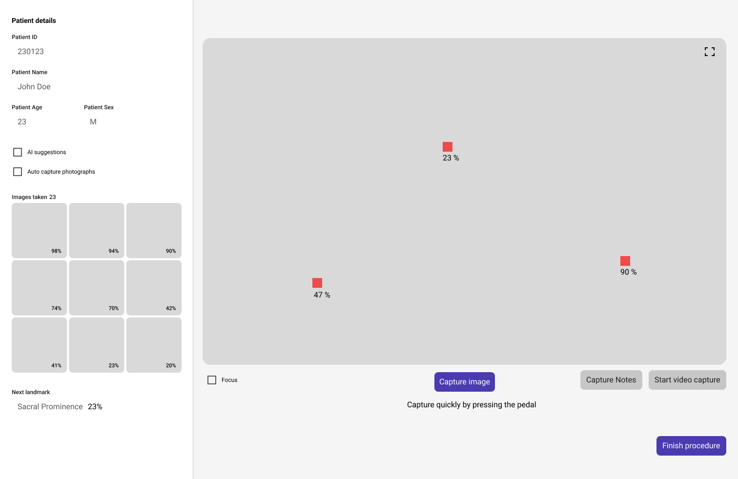
Another feature we were asked to design for during our internship, was a way to include an interface for an AI that they were developing at the company. This would help them detect regions that may have required special interest from the doctor. We ideated several ideas on how we could add the AI without disturbing the doctors during the operation. Allowing options that would allow the doctors to switch off the AI was an unusually well-liked feature by the doctors.
We designed an AI interface that would estimate the likelihood of a problem existing and taking an image automatically in the background if the estimate was higher than a specific margin. The doctors could allow the AI to change the specific number of photos or the estimate. This allowed us to integrate the AI without introducing distractions or increasing the time spend on creating the report.
DESIGN
Focusing on the operation
We also focused a lot of attention on creating a well-designed operation procedure start. We wanted to allow users to be able to have feedback on how the images would be visible in different scopes before they needed to connect them to the product. In order to do so we selected a list of basic image filters and edits that could be easily used so that doctors could use them for identifying anomalies in the image faster. We also decided to go with preset selection of filters that could be added to the product after testing with a few doctors. This would help doctors simplify the speed at which they could set up the scope and image details to their liking.
LEARNING
Research is the heart of UX
Although the case study only shows several of the screens we had designed, the majority of our time was spend in the hospitals with the doctors. This allowed us to quickly identify potential pain points and prioritize them based on our own first hand data points. I believed this was the most vital aspect of the project. It allowed us to keep the design relevant and organize the information as efficiently as we could.
Thinking of how to allow for AI in the application so that it enhanced the doctors ability to identify anomalies was also an interesting task. We had iterated several ideas that involved a suggestion box, grid layouts, animations etc. But allowing doctor's the ability to switch off the AI was the most interesting design choice I think we made. This was noted by doctors as well, who believed they might not always want distracting information on screen while using the application.
I learned a lot during this project about design, especially on research and ideation phase. We did not have much time to properly test our designs other than gather direct feedback. This is where I think rapid prototyping really comes into play. If we had tested smaller sections rather than the larger design prototypes I believed we could have made several adjustments that improved the overall design of the product.