Spacio
Spacio is a B2B rental property management software. The product aims to offer a comprehensive overview to meet all rental property needs. We wanted to create a B2B product that was useful and intuitive for user to to use. I was the product manager and was responsible for crafting the requirements into usable flow with a well defined interface. Since our team was small and inexperienced, I also had to take on additional roles that allowed me to prioritize the requirements and development needs. It was an exciting project that made me work in design, product and developments spheres of a software design process.
RESEARCH
Current system and problems
We started by conducting a UX audit of the existing software to understand possible places of improvement. The initial software was riddled with visual inconsistency and unintuitive user flows.
After testing the existing design based on a list of jobs-to-do for the users, we prioritized our design changes so that we could focus on the most impactful design decisions first.
The product also had difficult and unintuitive content copy and navigation options. We decided to find out more appropriate semantic terms for the product. We also re-organized the navigation options so that it would be more intuitive for the user.
DESIGN
Notification system
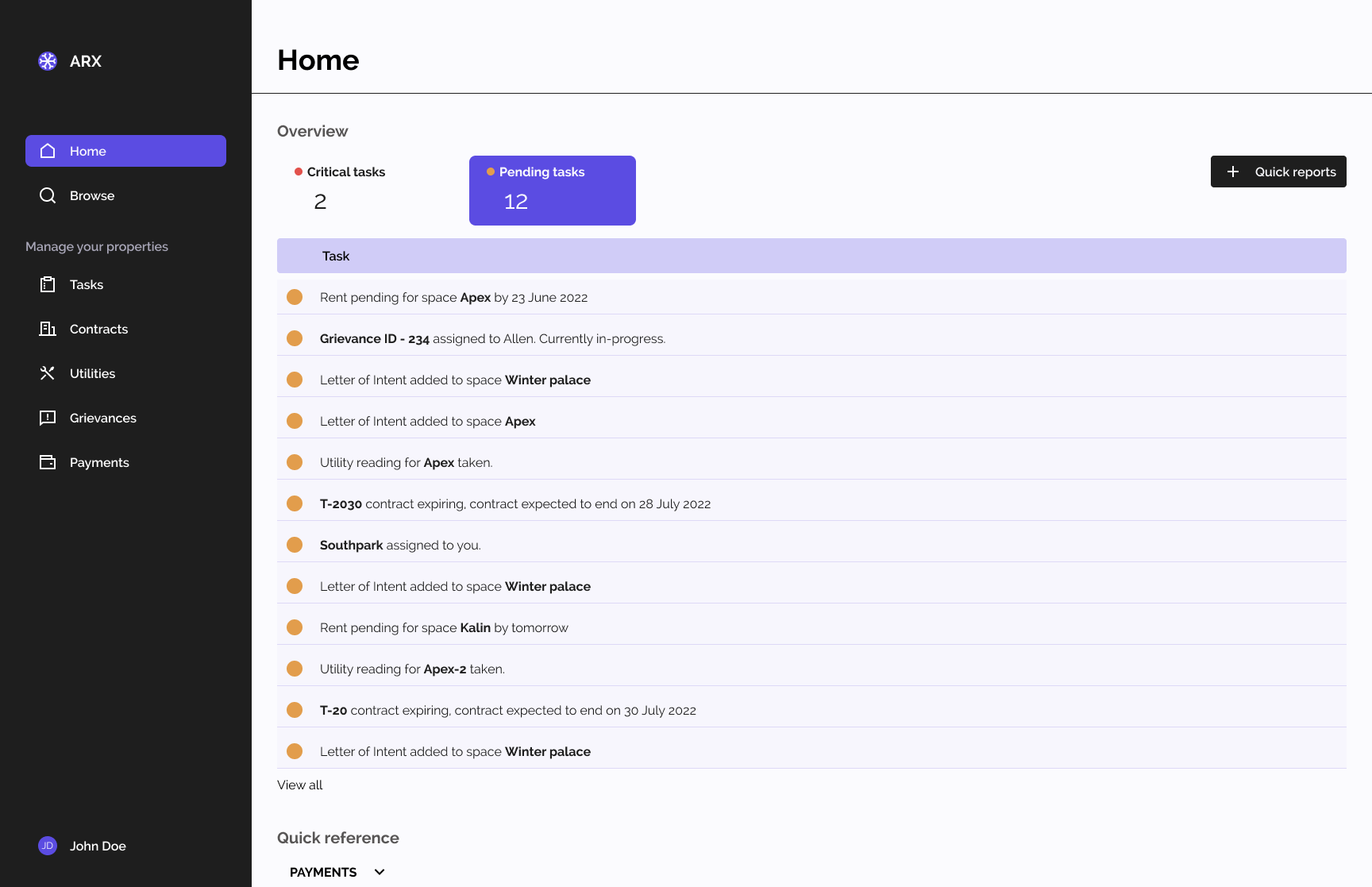
One of the major issues, we had to deal with was the notification system used by the product. The notification system had to be able to handle multiple cases of information directly in a single page. Previous design iterations attempted to tackle this issue through a dashboard-style layout.
We opted for a task-centric approach in our prototypes, prioritizing actionable tasks over overwhelming data points. This design shift enabled users to swiftly comprehend their next steps, leading to improved task completion rates through the dashboard as was required.

DESIGN
Handling a contract
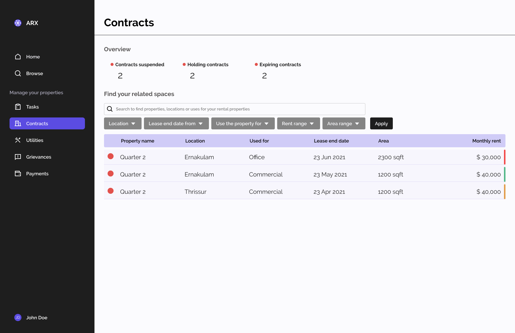
Another major change was in the how we handled contracts, addressing a previously unintuitive process for handling contracts. Initially, contracts were organized as properties owned by the user, leading to confusion during tasks such as suspending a contract for a property. We switched over to a contract based solution based on user testing. This shift was prompted by difficulties users found in navigating yo the location of contracts within the previous product's information architecture. By adopting a contract-centric approach, we saw a 40-50% increase in how many of the tasks regarding contract suspension was completed.

DESIGN
Payments system
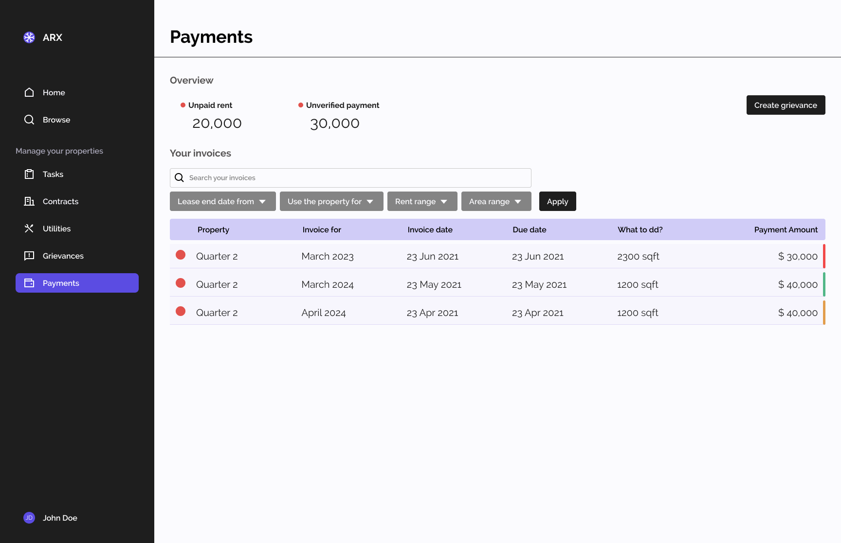
We improved the payments system of the product to accommodate other forms of transactions, including rent, utility invoices, and security deposits. Unlike previous iterations that solely addressed rental invoices, our new designs encompassed a broader spectrum of revenue streams crucial to the rental business.
This approach was a propsoal made after discussions with potential clients, where we uncovered additional product requirements beyond the initial scope. This insight allowed me to deliver a more comprehensive solution tailored more directly with the user needs.

PROCESS
Auditing the competition
Due to limited resources for customer interviews, I employed alternative methods to understand user needs. One key approach was auditing existing solutions like our previous product and competitors such as Buildium. This provided valuable insights into user expectations and informed the initial information architecture.
Based on these insights, I created smaller designs for specific tasks, which were then tested by quality assurance engineers and colleagues. While this approach was pragmatic given the company's focus on development, it resulted in a generalized understanding of user needs rather than specific user personas.
PROCESS
Creating a design system
As the sole designer, I aimed to create a cohesive design system for the project, but encountered challenges in converting designs to functional components in a pace expected by the business. To increase development speed, the business opted for a purchased template, limiting design flexibility to predefined layouts and components. Despite constraints, this shift provided an opportunity for me to focus on coding prototypes directly within the template framework.
LEARNINGS
Managing development, product and design
Managing stakeholder expectations was the primary challenge I faced in this project. Operating within the dynamic environment of a small-scale startup, where processes were evolving and requirements frequently shifted without user input, was a difficult task. Coupled with a team of junior developers, each iteration of the product encountered delays, too often requiring design adjustments to align with developer constraints rather than user needs.
Despite these challenges, navigating the complexities of stakeholder management provided invaluable lessons. I honed my ability to effectively communicate design concepts through prototypes, leveraging direct prototyping with code as a powerful tool. This multidisciplinary approach allowed me to seamlessly integrate product, development, and design perspectives, improving my understanding of the software development lifecycle.