The Muse
Muse is an audio tour app built to help users have a more interactive museum experience. The app is designed to increase retention, improve engagement and overall make museums a more enjoyable and educational visit for everyone.
RESEARCH
What are the problems museums face?
We conducted interviews to understand why people visited museums and what were the most common pain points associated with visiting museums. The interviews gave us some information on how, while many of the users found the knowledge and artifacts in museums interesting, visitors found it difficult to recall any of the information after leaving the museum.
We identified a few white paper sources that allowed us to find existing research on museum pain points which also helped inform our design decisions. We also conducted audits on existing museum apps like the walt disney museum and the chicago museum which helped suggest common design solutions and competitive features offered by others.
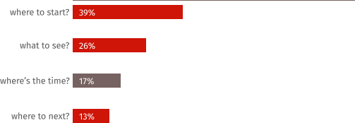
From the above chart we see that most of the pain points directly correlate with navigating a museum. So this was the major pain point we decided we should prioritize.
DESIGN
Navigating the contents of a museum
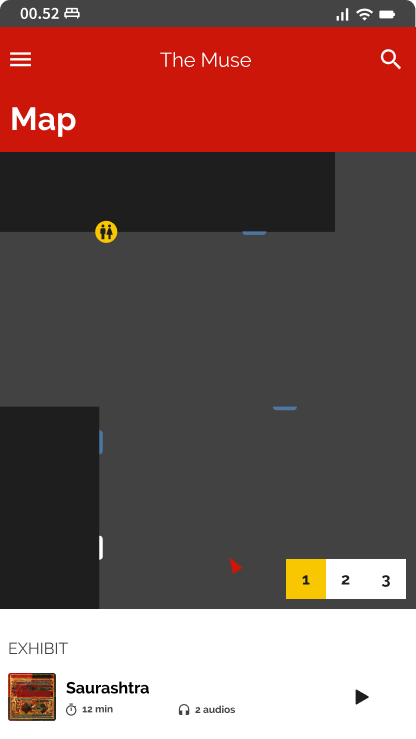
Visitors often find it difficult to navigate the contents of a museum. This makes it difficult for users to find exhibits that suites their interests. We ideated different methods of mapping the exhibits onto the screen but decided a simple approach of user directed mapping was best. Although we wanted users to be able to orient themselves inside the map, this would be difficult without external hardware that would help triangulate the user location. So we decided to orient the user using the current audio the user decided to scan and play. This would help us find an approximate idea of the user location.
DESIGN
Find all your favorite exhibits
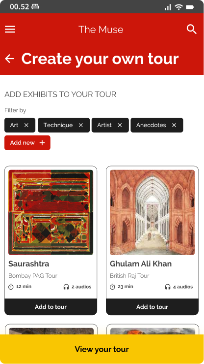
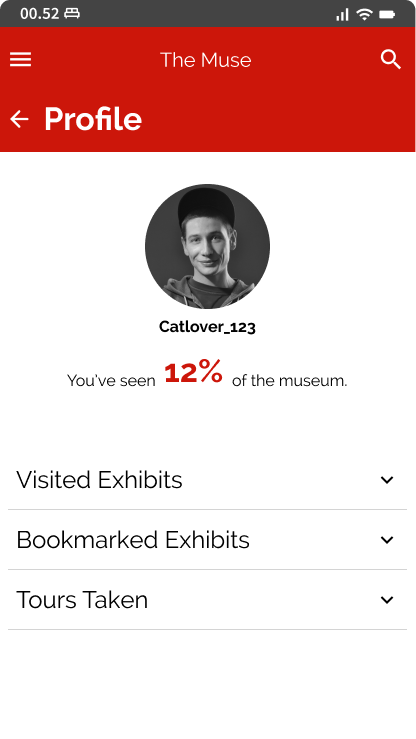
By allowing users to create their own tours we helped to solve for the issue of time as well. People interested in specific exhibits could move ahead and spend more time on exhibits that pique their curiosity. In order to incentivize users to view all the exhibits we also decided to create a completion progress tracker which introduced an element of gamification. By providing a tangible sense of accomplishment that can be shared socially we allow users to create a more stronger sense of connection with the museum.
DESIGN
Allowing visitors to engage with a community
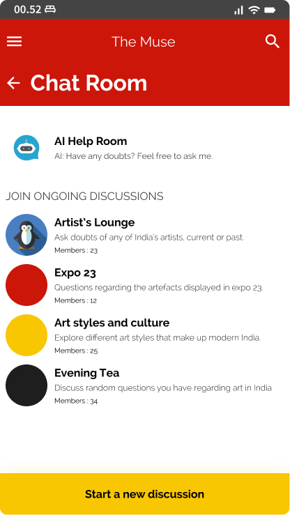
To create engagement we also added a community feature that allowed users to ask questions to other visitors, staff or even an AI chatbot. By allowing users to clarify questions with other people interested in the same topics and more knowledgeable staff, we decided to introduce a community aspect to the museum. This would also help users retain information by providing them with a feedback loop and improve their engagement with the museum.
DESIGN
Visual design for the project
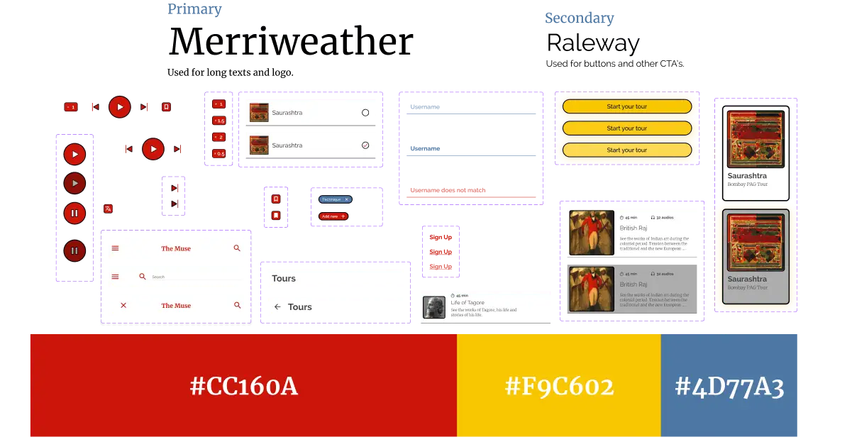
The final aspect of the design was visual. We wanted to create a fun and engaging atmosphere for the visitors, so we decided to go with bold, primary colors and bold lines. Although it was not a primary focus of design, we did have fun trying to create an interesting interface that users would enjoy.
PROCESS
Working our way through
The final app was the result of a 2 week long design effort. We attempted to go through as many iterations as possible in the shortest time and moved quickly through design phases to collect feedback and improve.
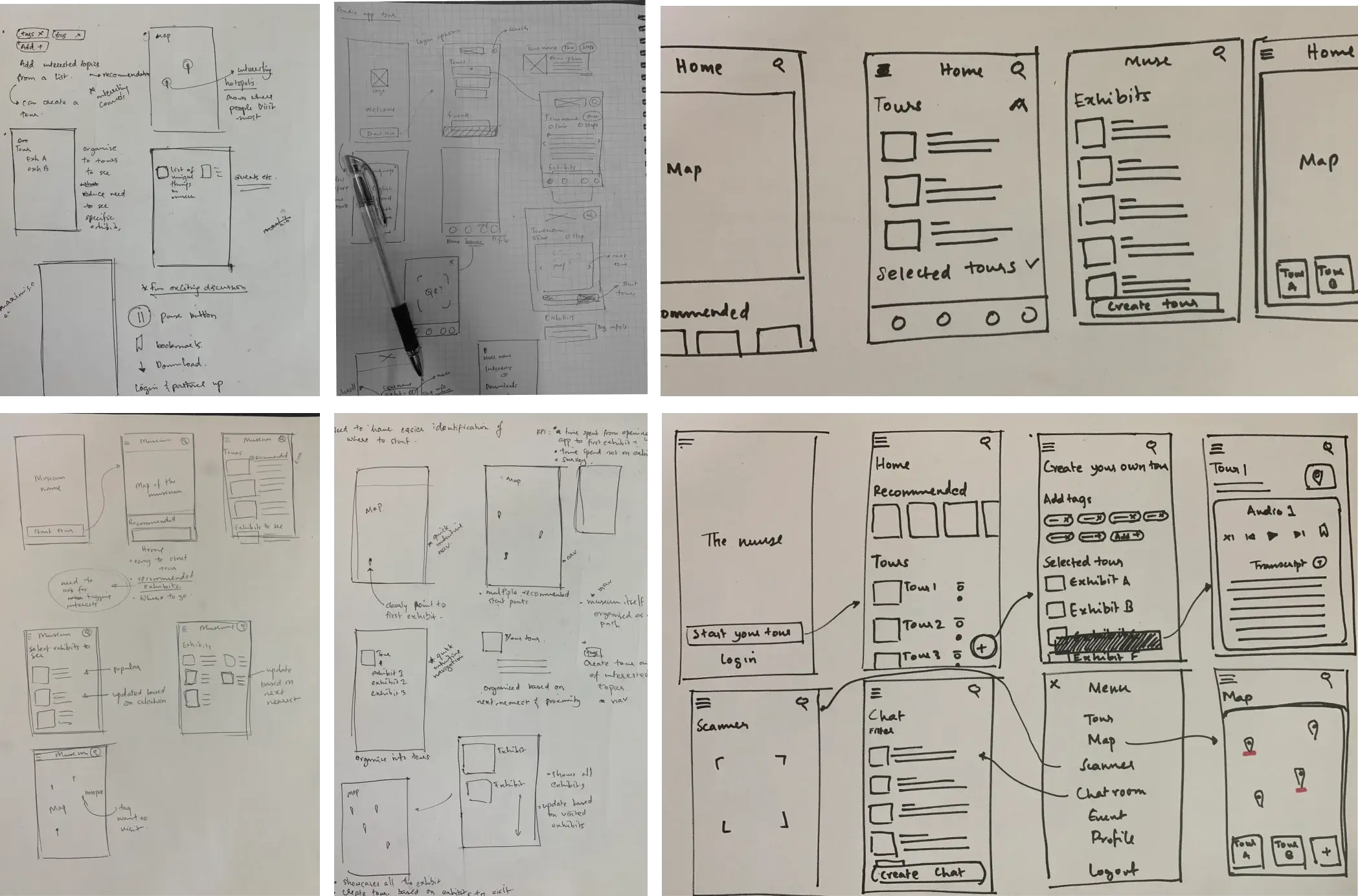
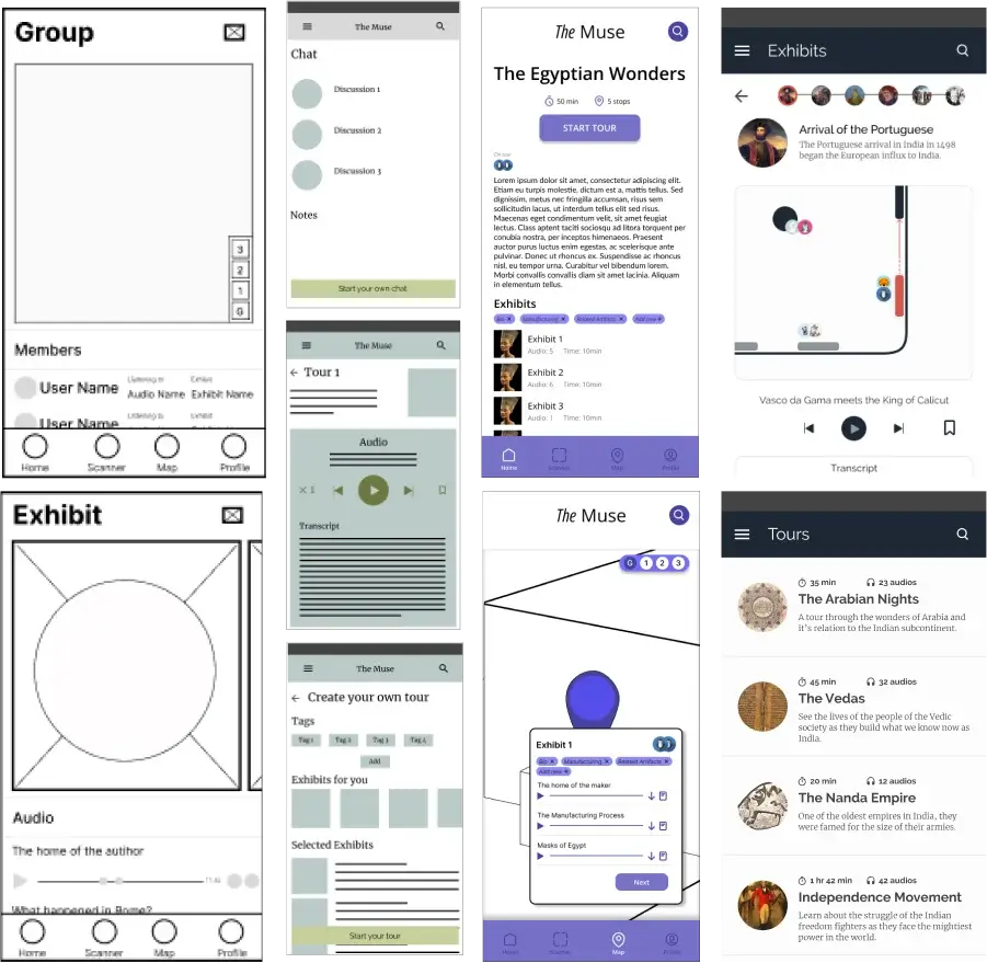
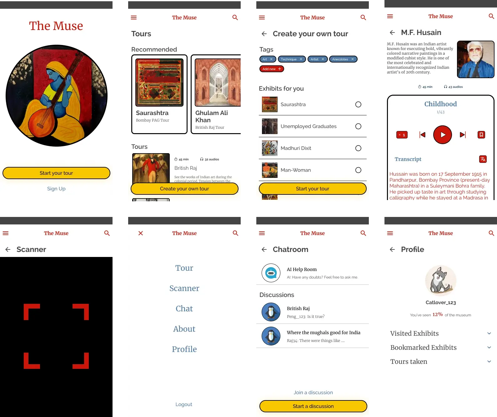
The initial paper sketches gave us an idea of what features we wanted to implement, while the higher fidelity mockups solidified where to place and what interactions to use. We did user testing among our peer group and collected feedback to improve quickly.
LEARNINGS
UI is important
The most difficult part of the process was getting a functioning aesthetic UI. Although we did test the functions, it was difficult to nail down a good UI since it was harder to get a good focus on what the users wanted. At the end of the project, I was proud of the effort put into the project. However, the UI was something I found dissatisfactory and difficult to enjoy. Looking back at the project, a lack of hierarchy and whitespace may be the main culprits making the interface appear noisy and cluttered. Regardless, I believe that the project made me realize the difficulty and importance of UI in the UX design process.